Generative fine art continuity is the thread I am following in this continuation of Seasonal Drift.
When I wrote the first Seasonal Drift post, I was trying to answer a simple question: should the code finish the picture, or should it create a good place for an artist to make the final choices?
I still think the second answer is better. But while working with the lyric gallery, I ran into another problem. The pictures could change so much from one line to the next that it became hard to believe they belonged to the same world.
That led to a new surface called Metamorphic Continuity.
Metamorphic Continuity: An unbroken process of transformation where underlying forms, materials, or philosophical states constantly shift while maintaining a persistent, connected existence. In Orrery Glyph, the artwork can change across lyric scenes without losing its identity, relationships, or memory.
Surface: An optional artistic and stagecraft treatment that specializes a theme’s existing artwork. It guides material expression, environmental behavior, continuity, and performance without replacing the parent theme’s visual identity.
The theme supplies the world, cast, and visual vocabulary. The surface directs how that world is staged, treated, and performed.
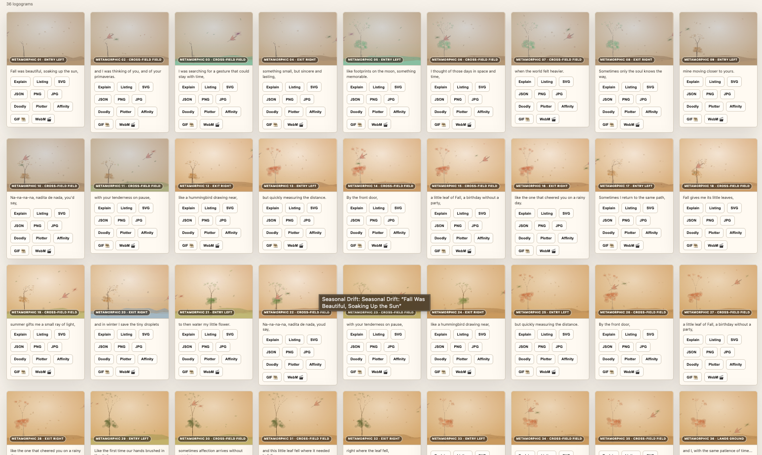
A 36-logogram continuity study. The labels are working notes for the studio, not part of the finished artwork.
When variety starts to erase memory
Seasonal Drift was already good at making variation. A line could change the season, the colors, the ground, the tree, the flowers, the leaves, or the bird. That kept the gallery from feeling like the same picture repeated.
The trouble was that too much change made the subject feel replaced instead of remembered. A tree that moves, changes shape, and changes surroundings in every frame does not feel like one tree. It feels like several unrelated trees.
I wanted the viewer to be able to say, “There it is again,” and mean it.
What I wanted to protect
The new surface keeps the important parts of Seasonal Drift:
So Metamorphic Continuity is not a replacement for Seasonal Drift. It is a way of giving the existing paintings a shared memory.
The simple rule
The working pattern is:
ENTRY → CROSS-FIELD → EXIT → LANDING
An entry introduces a subject and its surroundings. The cross-field pictures keep the surroundings steady while the subject moves. An exit lets the subject leave. A new entry can then introduce a new set of surroundings.
During the cross-field part, the tree should stay the same tree. The hill can stay the same hill. Only the selected moving subjects should change position, angle, scale, or pose.
That sounds obvious, but it was not obvious in the first version. I had to make it explicit.
What the experiments taught me
### One long crossing was too long
At first, the whole song felt like one entry followed by one exit. The beginning and end were clear, but the middle felt flat.
The better answer was to divide the gallery into smaller passages. Each passage gets its own entry, a few cross-field pictures, and an exit. A new passage can change the prop set without making the middle of the previous passage unstable. I think of each passage as a short shot in a quiet film. The shot has a beginning, a held middle, and a clear release. Once the subject is out, I can let the next scene bring in a new prop, a new season, or a new emotional temperature.
For long songs, the surface can add quiet padding pictures. These do not represent new lyric lines. They give the subject enough time to leave, and they help the gallery finish in a clean four-card row.
### Edge handoffs need to be visible
Putting a subject at the exact edge of one picture and the exact opposite edge of the next sounds correct in code. In a small gallery, it can still disappear.
The better handoff leaves about half of the subject visible at the outgoing edge. The next picture begins with the matching half at its incoming edge. The height, direction, angle, and scale carry across the seam.
### The last scene needs different treatment
The end of a song is not just another exit. In the final passage, the subject needs to arrive and settle.
The landing scene therefore keeps an arrival trace while also showing the subject dropping toward the ground. It is a small compromise, but it is much easier to read than an abrupt jump from an edge fragment to a finished landing.
The cast should come from the words
I do not want every song to use a leaf and a hummingbird. They fit many Seasonal Drift songs, but they should not become a formula.
Samantha should be able to read the lyrics and choose from a wider group of subjects:
The motion system already knows how to carry several participants. The next step is to give Seasonal Drift more drawn forms, so Samantha’s choices can become visible objects instead of remaining only planning notes. I also want the provider to be honest about uncertainty. If a lyric suggests both a river and a road, it should be able to choose one as the main anchor and keep the other as a quiet secondary cue. A useful composition is not a pile of symbols. It is a small cast with clear jobs.
How a passage is built
I now describe a passage as a small, repeatable recipe. First comes a new screen with its fixed background, ground, camera view, and primary prop. That is the stage. Then the leading subject enters from the left. The follower appears behind it, with enough space to read as a companion rather than a sticker attached to the first object.
The cross-field screens reuse that stage. The leaf might tilt into the wind while the hummingbird pauses, looks around, or takes a slightly higher line. In another song, the bee can lag behind a flower, or a bird can circle a branch before following it. These variations are intentional. They make the relationship feel alive while the scene itself remains stable.
The exit is a handoff, not a disappearance. I want the leading subject to be visibly half out of the right edge. The next entry can show the matching half at the left edge. This gives the eye a simple bridge to follow. The follower does not have to be in the exact same place. It only has to respect the shared direction and remain behind the leader unless the lyric calls for a deliberate change.
After the exit, the next passage may change the prop set. That is where a lantern can replace a gate, or a water wheel can replace a lantern. The change has a reason and a boundary. It does not happen halfway through a crossing just to create variety.
Why the fixed stage matters
I learned that a moving object is easier to read when the room around it holds still. A tree trunk, hill line, or patch of grass gives the viewer a measuring stick. Without that stick, a subject can appear to jump even when its coordinates are moving smoothly.
This is also important for print. A gallery card is small, but a JPG may become a 20 by 20 inch print. A stable stage keeps the artwork legible at both scales. The motion can remain subtle in a small preview and still feel intentional when the image is enlarged.
The fixed stage does not mean the picture is lifeless. Wind can move a few loose leaves. Light can warm the upper sky. A distant cloud can shift slightly between passages. I treat these as atmosphere, not as replacement scenery. The main prop remains the identity anchor.
What Samantha should decide
Samantha is most useful when she makes a clear proposal that I can inspect. For each lyric section, I want a compact plan with five parts: the anchor, the lead, the follower, the path, and the handoff.
The anchor answers, “What stays in the room?” It might be a gate for arrival, a lantern for warmth, a water wheel for persistence, or a moon for longing. The lead answers, “What is carrying the lyric forward?” The follower answers, “What is responding to it?” The path answers, “How do they move?” The handoff answers, “Where do they leave so the next passage can begin?”
This structure leaves room for taste. Samantha can propose a flower and bee, but I can still adjust the scale or ask for a quieter bee. It can suggest fireflies and a moth for a night song, while I decide whether the moth should hover close or arrive late. The architecture stays the same even when the cast changes.
A note about variety
Variety is valuable when it changes the feeling, not merely the inventory. A different leaf shape is not automatically a different idea. A new relationship can be.
For a summer lyric, the hummingbird may race ahead during a bright chorus and slow down during a reflective verse. For a song about grief, a bird may remain near the branch while the light changes around it. For a song about beginnings, a seed can stay low in the frame through several passages before petals enter in the landing scene.
I want the provider to make those choices from the words, but I also want the output to stay editable. The best result is a strong first draft, not a locked answer.
The practical payoff
This approach makes the surface reusable across songs. A short song can use one passage and a landing. A longer song can repeat the recipe several times, adding padding screens when a four-card row needs to breathe. A chorus can return to an earlier cast without copying the exact same pose. A bridge can introduce a new anchor while preserving the motion grammar.
It also makes debugging easier. If a subject appears on the wrong edge, I can inspect the entry and exit keyframes instead of guessing which random scene changed it. If the follower overlaps the lead, I can adjust the relationship in the motion plan. If a prop changes too early, I know the boundary between passages was broken.
That clarity matters to me because the surface is meant to support fine art, not hide behind automation. I want to know why an image looks the way it does. I want a collector, printer, or another artist to be able to understand the decisions well enough to continue them.
Where I am leaving the door open
I am not trying to remove surprise. I am trying to put surprise in the right place. The middle of a passage should reward attention with small changes in pose, distance, and light. The boundary between passages can offer a larger change in props or season. The landing can resolve the gesture without pretending that every story has a neat ending.
There will still be imperfect cases. A lyric may be ambiguous. A generated subject may need a redraw. A print may reveal a detail that was invisible in the browser. Those are normal parts of making art. The system should make them easy to see and easy to revise.
For me, that is the real measure of the work. The code is successful when it gives a feeling enough continuity to become a picture, and enough room to remain a living artwork.
The compromises we kept
Fine-art beautification is not the same as adding the most motion or the most novelty. I kept a few limits because they protect the work.
1. Stable surroundings over constant change. A repeated tree may be less surprising, but it gives the eye something to remember.
2. Working labels during development. The entry and exit badges help me inspect the sequence. They are not meant to be part of the finished export.
3. Padding over cramped timing. An extra picture can feel slightly artificial, but it is better than squeezing an exit and a landing into one frame.
4. A small cast over a crowded scene. Samantha can choose several companions without making every picture compete for attention.
5. Repeatable motion over random motion. A collector should be able to return to a piece and get the same work again.
These are tradeoffs, but they are useful tradeoffs. They keep the code in service of the artwork.
Why I think this is a good balance
The result is not a cartoon and it is not a static set of unrelated images. It is a group of fine-art studies with a gesture moving through them.
Seasonal Drift supplies the beauty: the season, the material, the colors, the ground, the trees, and the atmosphere. Samantha can help choose the subjects and their relationships. Metamorphic Continuity gives those relationships time, direction, and memory.
The code does not have to make every final decision. It has to make the important choices visible enough for an artist to recognize them, change them, and carry them further.
That is the tradeoff I want to keep: enough structure for continuity, enough restraint for beauty, and enough openness for the hand to finish the work.